Industry experts Pantone have announced the color of the year 2019 as Pantone 16-1546 Living Coral. This vibrant yet mellow pinky orange kicks off 2019 in a positive light.
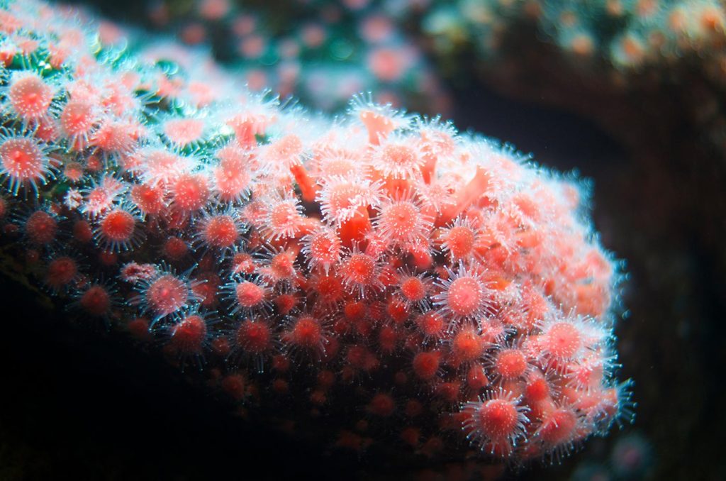
Personally, I couldn’t be happier with this glorious shade of golden peachy-pink. A welcome contrast to the darker days which usually accompany this time of year.
‘An animating and life-affirming coral hue with a golden undertone that energizes and enlivens with a softer edge’ Pantone

Pantone is the global authority on color for the design industry. And for over 20 years, their color of the year has a profound impact on many industries.
Fashion, product and interior design all rely on their thorough research and trend analysis. This careful curated process results in their chosen color tone of the year. See my link here for my blog on last years’ color of the year 2019.
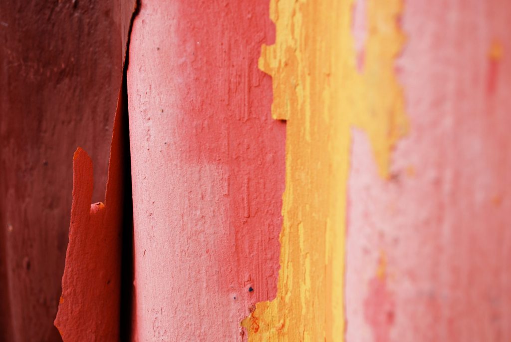
“Representing the fusion of modern life, PANTONE Living Coral is a nurturing color that appears in our natural surroundings and at the same time, displays a lively presence within social media.” Pantone
So, when you see this colour pop out at you next time you are out shopping for stationary, you will know it was carefully chosen by color experts for many different reasons. The experts see this color reflecting modern times and our current mood. Thankfully it’s a positive one!
First of all, I would like to bring your focus back to interiors (and thanks to this color) all things bright and beautiful.
Need some home inspiration for this year? – here are some quick interior design tips to bring the color of the year 2019 into your home…
4 ways to update your home using
Pantone’s Color of the year 2019
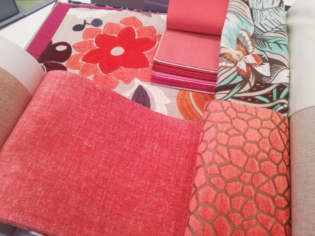
1. Recline in coral sunshine
Time to give that tired sofa or old arm chair a new life. Re-upholster with these beautiful fabrics from Romo, Matthew Williamson and Osborne & Little. Perfect for reclining and dozing off. Perhaps dreaming of the big blue and coral reefs. Roll on the summer!
Industry experts Pantone have announced the color of the year 2019 as Pantone 16-1546 Living Coral. This vibrant yet mellow pinky orange kicks off 2019 in a positive light.

Personally, I couldn’t be happier with this glorious shade of golden peachy-pink. A welcome contrast to the darker days which usually accompany this time of year.
‘An animating and life-affirming coral hue with a golden undertone that energizes and enlivens with a softer edge’ Pantone

Pantone is the global authority on color for the design industry. And for over 20 years, their color of the year has a profound impact on many industries.
Fashion, product and interior design all rely on their thorough research and trend analysis. This careful curated process results in their chosen color tone of the year. See my link here for my blog on last years’ color of the year 2019.

“Representing the fusion of modern life, PANTONE Living Coral is a nurturing color that appears in our natural surroundings and at the same time, displays a lively presence within social media.” Pantone
So, when you see this colour pop out at you next time you are out shopping for stationary, you will know it was carefully chosen by color experts for many different reasons. The experts see this color reflecting modern times and our current mood. Thankfully it’s a positive one!
First of all, I would like to bring your focus back to interiors (and thanks to this color) all things bright and beautiful.
Need some home inspiration for this year? – here are some quick interior design tips to bring the color of the year 2019 into your home…
4 ways to update your home using
Pantone’s Color of the year 2019

1. Recline in coral sunshine
Time to give that tired sofa or old arm chair a new life. Re-upholster with these beautiful fabrics from Romo, Matthew Williamson and Osborne & Little. Perfect for reclining and dozing off. Perhaps dreaming of the big blue and coral reefs. Roll on the summer!
Industry experts Pantone have announced the color of the year 2019 as Pantone 16-1546 Living Coral. This vibrant yet mellow pinky orange kicks off 2019 in a positive light.

Personally, I couldn’t be happier with this glorious shade of golden peachy-pink. A welcome contrast to the darker days which usually accompany this time of year.
‘An animating and life-affirming coral hue with a golden undertone that energizes and enlivens with a softer edge’ Pantone

Pantone is the global authority on color for the design industry. And for over 20 years, their color of the year has a profound impact on many industries.
Fashion, product and interior design all rely on their thorough research and trend analysis. This careful curated process results in their chosen color tone of the year. See my link here for my blog on last years’ color of the year 2019.

“Representing the fusion of modern life, PANTONE Living Coral is a nurturing color that appears in our natural surroundings and at the same time, displays a lively presence within social media.” Pantone
So, when you see this colour pop out at you next time you are out shopping for stationary, you will know it was carefully chosen by color experts for many different reasons. The experts see this color reflecting modern times and our current mood. Thankfully it’s a positive one!
First of all, I would like to bring your focus back to interiors (and thanks to this color) all things bright and beautiful.
Need some home inspiration for this year? – here are some quick interior design tips to bring the color of the year 2019 into your home…
4 ways to update your home using
Pantone’s Color of the year 2019

1. Recline in coral sunshine
Time to give that tired sofa or old arm chair a new life. Re-upholster with these beautiful fabrics from Romo, Matthew Williamson and Osborne & Little. Perfect for reclining and dozing off. Perhaps dreaming of the big blue and coral reefs. Roll on the summer!
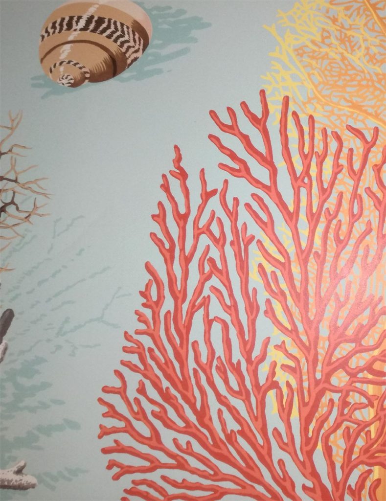
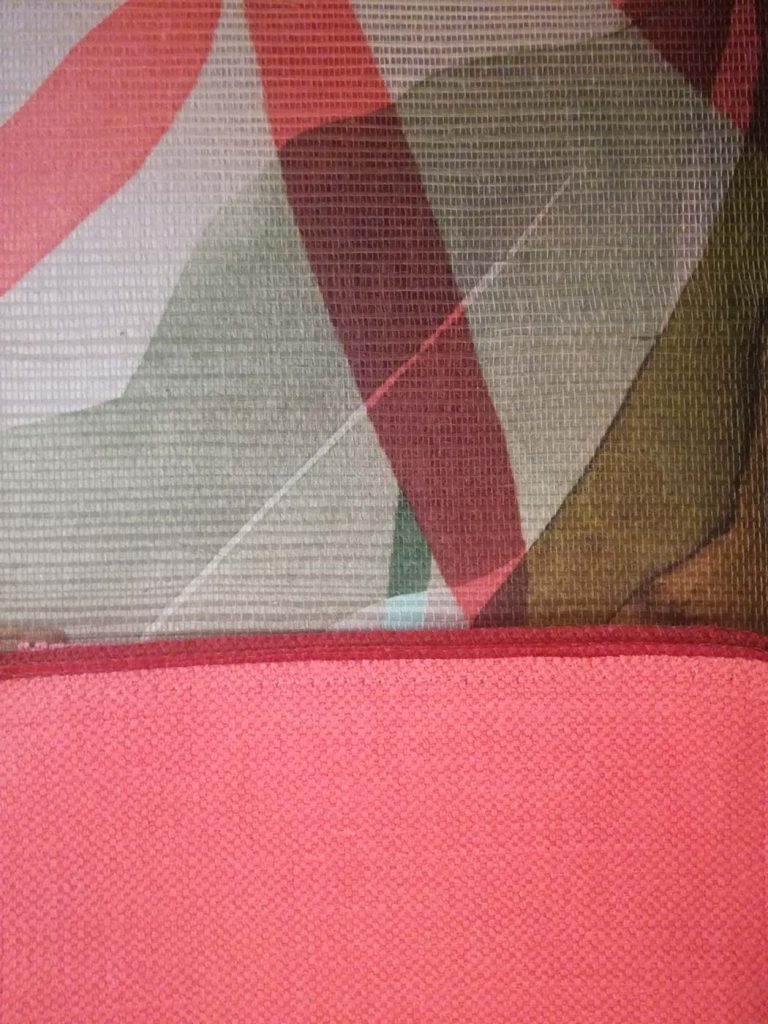


2. Bring in the sea
Make those reef dreams an every-day reality with this stunning wallpaper (left image) from Manuel Canovas. Perfect for a feature wall, garden room or kids’ room. Add plants such as strings of pearls to evoke true sea-like décor.
3. Add a Cushion Color Pop
Good news. Pantone’s’ color of the year 2019 compliments most color palettes (see above and below). Neutrals, blues and greens all work well. Want an instant on-trend color update? – simply add a coral printed cushion. Fabric (above right) from Romo. Watch that color pop!
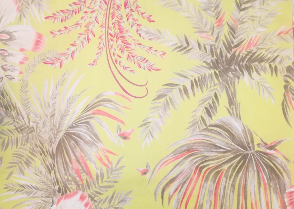
4. Coral Dip
And finally, if a subtle splash of coral is more your thing then look no further than this striking wallpaper by Mathew Williamson at Osbourne and Little. Set in a backdrop of chartreuse, this tropical foliage design simply takes a shallow dip into coral.
There you have it. Our 2019 dive into Living Coral, the color of the year. I hope it inspires you in a positive way this year. Get in touch if you see anything you like, we would love to hear from you.
Til’ next time
Geraldine & Pia xx
2. Bring in the sea
Make those reef dreams an every-day reality with this stunning wallpaper (left image) from Manuel Canovas. Perfect for a feature wall, garden room or kids’ room. Add plants such as strings of pearls to evoke true sea-like décor.
3. Add a Cushion Color Pop
Good news. Pantone’s’ color of the year 2019 compliments most color palettes (see above and below). Neutrals, blues and greens all work well. Want an instant on-trend color update? – simply add a coral printed cushion. Fabric (above right) from Romo. Watch that color pop!

4. Coral Dip
And finally, if a subtle splash of coral is more your thing then look no further than this striking wallpaper by Mathew Williamson at Osbourne and Little. Set in a backdrop of chartreuse, this tropical foliage design simply takes a shallow dip into coral.
There you have it. Our 2019 dive into Living Coral, the color of the year. I hope it inspires you in a positive way this year. Get in touch if you see anything you like, we would love to hear from you.
Til’ next time
Geraldine & Pia xx
2. Bring in the sea
Make those reef dreams an every-day reality with this stunning wallpaper (left image) from Manuel Canovas. Perfect for a feature wall, garden room or kids’ room. Add plants such as strings of pearls to evoke true sea-like décor.
3. Add a Cushion Color Pop
Good news. Pantone’s’ color of the year 2019 compliments most color palettes (see above and below). Neutrals, blues and greens all work well. Want an instant on-trend color update? – simply add a coral printed cushion. Fabric (above right) from Romo. Watch that color pop!

4. Coral Dip
And finally, if a subtle splash of coral is more your thing then look no further than this striking wallpaper by Mathew Williamson at Osbourne and Little. Set in a backdrop of chartreuse, this tropical foliage design simply takes a shallow dip into coral.
There you have it. Our 2019 dive into Living Coral, the color of the year. I hope it inspires you in a positive way this year. Get in touch if you see anything you like, we would love to hear from you.
Til’ next time
Geraldine & Pia xx


